CLUB HISTORY
1900-1905

Once Lazio was founded, the need arose to associate the club with a coat of arms to represent the new capital's sporting association, so shortly afterwards they opted for a 'Swiss' shield on a blue background divided by a white oblique bar. Some Lazio jerseys from that era bear the first club logo in the centre or at heart height, most notably that of Pericle Pagliani, who was the greatest Italian runner at the beginning of the last century.
1905-1914
On the cap of Bruto Seghettini in a photo taken at the Villa Borghese on 1 October 1905 and later on a letter dated 23 April 1906, signed by President Fortunato Ballerini, debuts the symbol adopted at that time, in which the Roman imperial eagle appears for the first time. The coat of arms depicts the bird of prey, emblem of the Roman legions, in a waiting position, resting on a shield with seven vertical bands, four blue and three white. The eagle's majestic wings are gathered downwards and follow the curve of the shield on the right side. The beak of the eagle supports a blue cartouche with the name 'S. Podistica Lazio'.
1914-1920
The eagle takes flight with outstretched wings on the Biancozzurro coat of arms used in a letterhead dated 17 April 1911, in which the bird of prey is inserted in a circular frieze, in perfect early 20th century Art Nouveau style, inside which is engraved both the company name of S.P.L. and the name 'Roma', placed at the base of the frieze itself, symbolising the indissoluble bond with the Eternal City. Four fluted Roman imperial style columns form the background.
1920-1927
Al termine della “Grande Guerra” sulle maglie da gioco della Lazio compare lo stemma contenente l’acronimo “SPL” (Società Podistica Lazio), nel quale le tre lettere di colore bianco sono intrecciate tra loro ed incastonate in un cerchio su sfondo azzurro. Curiosamente non è raffigurata l’aquila, da sempre simbolo di nobiltà e fierezza, strettamente legata alla Roma dei Cesari e simbolo di rappresentanza delle Legioni Romane.
1927-1936
An ordinance of the National Fascist Party imposed on sports clubs the presence of the regime symbol on their coats of arms. Lazio, therefore, complied and prepared a three-pointed shield at the top, containing four white stripes, two blue ones and a Roman column with the fascio littorio in the centre. The new coat of arms features an oblique band containing the new company name 'S.S. Lazio', adopted on 19 June 1926.
1936-1948
The coat of arms with the fascio littorio (fasces) remained until 1942, but in 1936, it was changed and formed into a vertical rectangle, in which the words 'S.S. Lazio' and the emblem of the regime stand out in the upper section, while seven white and blue stripes alternate in the lower section. Subsequently, with the crisis of Fascism, the 'littorio' symbol disappears from this coat of arms and the words 'S.S. Lazio' are enlarged, occupying the entire upper section.
1948-1963
In the year of the adoption of the Republican Constitution, the company logo began to take on a modern appearance. It is the Roman imperial eagle with spread wings surmounting a shield with seven vertical bands, four white and three blue, including the central one. Above the bands is the horizontal inscription containing the company name 'S.S. Lazio'. This coat of arms will undergo some graphic or chromatic modifications over the years, but it will essentially remain unchanged to this day.
1963-1968
The more futuristic version comes through a reworking of the previous logo, made more modern by a hint of stylisation of the bird of prey. The eagle still presents itself with spread wings, is redefined in all its proud splendour and increases its size in harmony with the shield. The coat of arms is aesthetically characterised by the balance present between the two components, presenting an elegant border, with seven bands inside, reversed from the previous ones, four white and three blue. In the upper part, as in the previous one, the horizontal inscription 'S.S. Lazio' appears.
1968-1979
After an initial graphic attempt in which the eagle was scaled down, the corporate coat of arms adopted at the end of the 1960s accompanied Lazio to the conquest of the first tricolour. The logo repeats the one used from 1948 onwards, but stylistically it is made much more incisive in its design and attention to detail. The eagle is of decidedly larger proportions than in the past and the shield, is represented with spread wings and surmounts three pairs of fluted white and blue bands.
1979-1982
From that year on, the hitherto identical Lazio Calcio and Polisportiva logos were split and the football section began to adopt its own versions. In 1979, the technical sponsor 'Pouchain' created the new social emblem that would appear on the shirts for the 1979/80 football season. It was a stylised coat of arms with extremely futuristic graphic features, featuring a stylised eagle in flight, dark blue in colour and with a white border. Enriching the value of the coat of arms is the club's new logotype with the inscription 'ss lazio' in small square letters, also used for the first time for commercial purposes.
1982-1983
President Casoni decided to implement a restyling of the club's image. The idea of creating a symbol that would represent that effect of sporting rebirth was entrusted to the company 'Marksport' of Florence, which found in the figure of its graphic designer Otello Cecchi the creator of the stylised eagle, made futuristic, aggressive and with wings outstretched and open to embrace the entire Lazio association. The new symbol, blue in colour, is inserted centrally in the square coat of arms and in the light blue underneath, the new logotype with the words 'LAZIO' in white is inserted.
1983-1984
The stylised eagle, introduced in the 1982/83 season and a characteristic element of the 'Maglia Bandiera', is still the club symbol under Chinaglia's presidency. The new coat of arms, no longer squared like the previous one, is rhomboid in shape, while the stylised bird of prey always finds its place in the central space. The inscription 'Lazio' in blue this time appears in the white upper part of the new logo, which will only be used for one season.
1984-1987
The coat of arms proposed for the 1984/85 season remains virtually unchanged in its geometric shape and in the presence of the stylised eagle. The only exceptions to the previous logo are the words 'Lazio' in blue, positioned this time below the stylised eagle, while a football stands out at the top. Disappearing from the new corporate emblem is light blue, the predominant colour of the Lazio jersey.
1987-1992
After years of absence, the symbol of the Roman imperial eagle with spread wings is back, no longer made graphically with a stylised technique. The bird of prey rests on a shield with five vertical bands, three blue and two white, surmounted by the words 'S.S. Lazio'. The restyling of the new logo in the traditional style is taken care of by BasicNet of Turin, the division of Robe di Kappa that supplies the game uniforms.
1992-2000
Under Cragnotti's presidency, the decision was made to adapt to the changes introduced by Polisportiva Lazio, thus modernising its coat of arms. The eagle with spread wings was slightly stylised and took on a gold colouring. Below it is a more minimalist shield, for the first time with three vertical bands, two light blue and one white. The inscription 'S.S. Lazio' appears in italics at the top.
2000-2001
On 9 January 2000, the 'Centenary' jersey made its debut, and at the same time, the new club crest, the subject of a competition between graphic studios, was designed to represent the symbol of the Cragnotti era, embellished with some celebratory elements. The new logo is enriched with the number '100' made oblique and resting on a golden base with the inscription '1900-2000' in white. The coat of arms was used from 9 January 2000 to 9 January 2001.
2001-2025
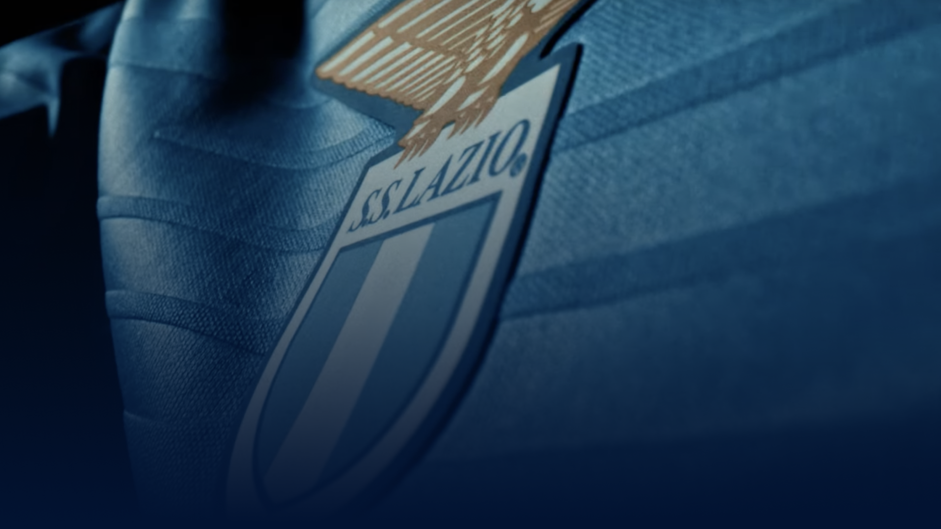
On 9 January 2001, with the closing of the 'Centenary' celebrations, the coat of arms designed under Cragnotti's presidency returned to the team's uniforms. The eagle with spread wings is slightly stylised and takes on a golden colouring. Below it is a shield with three vertical bands, two light blue and one white. The inscription 'S.S. Lazio' appears in italics at the top. This is the social emblem still in force today.
1900-1905
Once Lazio was founded, the need arose to associate the club with a coat of arms to represent the new capital's sporting association, so shortly afterwards they opted for a 'Swiss' shield on a blue background divided by a white oblique bar. Some Lazio jerseys from that era bear the first club logo in the centre or at heart height, most notably that of Pericle Pagliani, who was the greatest Italian runner at the beginning of the last century.
1905-1914
On the cap of Bruto Seghettini in a photo taken at the Villa Borghese on 1 October 1905 and later on a letter dated 23 April 1906, signed by President Fortunato Ballerini, debuts the symbol adopted at that time, in which the Roman imperial eagle appears for the first time. The coat of arms depicts the bird of prey, emblem of the Roman legions, in a waiting position, resting on a shield with seven vertical bands, four blue and three white. The eagle's majestic wings are gathered downwards and follow the curve of the shield on the right side. The beak of the eagle supports a blue cartouche with the name 'S. Podistica Lazio'.
1914-1920
The eagle takes flight with outstretched wings on the Biancozzurro coat of arms used in a letterhead dated 17 April 1911, in which the bird of prey is inserted in a circular frieze, in perfect early 20th century Art Nouveau style, inside which is engraved both the company name of S.P.L. and the name 'Roma', placed at the base of the frieze itself, symbolising the indissoluble bond with the Eternal City. Four fluted Roman imperial style columns form the background.
1920-1927
Al termine della “Grande Guerra” sulle maglie da gioco della Lazio compare lo stemma contenente l’acronimo “SPL” (Società Podistica Lazio), nel quale le tre lettere di colore bianco sono intrecciate tra loro ed incastonate in un cerchio su sfondo azzurro. Curiosamente non è raffigurata l’aquila, da sempre simbolo di nobiltà e fierezza, strettamente legata alla Roma dei Cesari e simbolo di rappresentanza delle Legioni Romane.
1927-1936
An ordinance of the National Fascist Party imposed on sports clubs the presence of the regime symbol on their coats of arms. Lazio, therefore, complied and prepared a three-pointed shield at the top, containing four white stripes, two blue ones and a Roman column with the fascio littorio in the centre. The new coat of arms features an oblique band containing the new company name 'S.S. Lazio', adopted on 19 June 1926.
1936-1948
The coat of arms with the fascio littorio (fasces) remained until 1942, but in 1936, it was changed and formed into a vertical rectangle, in which the words 'S.S. Lazio' and the emblem of the regime stand out in the upper section, while seven white and blue stripes alternate in the lower section. Subsequently, with the crisis of Fascism, the 'littorio' symbol disappears from this coat of arms and the words 'S.S. Lazio' are enlarged, occupying the entire upper section.
1948-1963
In the year of the adoption of the Republican Constitution, the company logo began to take on a modern appearance. It is the Roman imperial eagle with spread wings surmounting a shield with seven vertical bands, four white and three blue, including the central one. Above the bands is the horizontal inscription containing the company name 'S.S. Lazio'. This coat of arms will undergo some graphic or chromatic modifications over the years, but it will essentially remain unchanged to this day.
1963-1968
The more futuristic version comes through a reworking of the previous logo, made more modern by a hint of stylisation of the bird of prey. The eagle still presents itself with spread wings, is redefined in all its proud splendour and increases its size in harmony with the shield. The coat of arms is aesthetically characterised by the balance present between the two components, presenting an elegant border, with seven bands inside, reversed from the previous ones, four white and three blue. In the upper part, as in the previous one, the horizontal inscription 'S.S. Lazio' appears.
1968-1979
After an initial graphic attempt in which the eagle was scaled down, the corporate coat of arms adopted at the end of the 1960s accompanied Lazio to the conquest of the first tricolour. The logo repeats the one used from 1948 onwards, but stylistically it is made much more incisive in its design and attention to detail. The eagle is of decidedly larger proportions than in the past and the shield, is represented with spread wings and surmounts three pairs of fluted white and blue bands.
1979-1982
From that year on, the hitherto identical Lazio Calcio and Polisportiva logos were split and the football section began to adopt its own versions. In 1979, the technical sponsor 'Pouchain' created the new social emblem that would appear on the shirts for the 1979/80 football season. It was a stylised coat of arms with extremely futuristic graphic features, featuring a stylised eagle in flight, dark blue in colour and with a white border. Enriching the value of the coat of arms is the club's new logotype with the inscription 'ss lazio' in small square letters, also used for the first time for commercial purposes.
1982-1983
President Casoni decided to implement a restyling of the club's image. The idea of creating a symbol that would represent that effect of sporting rebirth was entrusted to the company 'Marksport' of Florence, which found in the figure of its graphic designer Otello Cecchi the creator of the stylised eagle, made futuristic, aggressive and with wings outstretched and open to embrace the entire Lazio association. The new symbol, blue in colour, is inserted centrally in the square coat of arms and in the light blue underneath, the new logotype with the words 'LAZIO' in white is inserted.
1983-1984
The stylised eagle, introduced in the 1982/83 season and a characteristic element of the 'Maglia Bandiera', is still the club symbol under Chinaglia's presidency. The new coat of arms, no longer squared like the previous one, is rhomboid in shape, while the stylised bird of prey always finds its place in the central space. The inscription 'Lazio' in blue this time appears in the white upper part of the new logo, which will only be used for one season.
1984-1987
The coat of arms proposed for the 1984/85 season remains virtually unchanged in its geometric shape and in the presence of the stylised eagle. The only exceptions to the previous logo are the words 'Lazio' in blue, positioned this time below the stylised eagle, while a football stands out at the top. Disappearing from the new corporate emblem is light blue, the predominant colour of the Lazio jersey.
1987-1992
After years of absence, the symbol of the Roman imperial eagle with spread wings is back, no longer made graphically with a stylised technique. The bird of prey rests on a shield with five vertical bands, three blue and two white, surmounted by the words 'S.S. Lazio'. The restyling of the new logo in the traditional style is taken care of by BasicNet of Turin, the division of Robe di Kappa that supplies the game uniforms.
1992-2000
Under Cragnotti's presidency, the decision was made to adapt to the changes introduced by Polisportiva Lazio, thus modernising its coat of arms. The eagle with spread wings was slightly stylised and took on a gold colouring. Below it is a more minimalist shield, for the first time with three vertical bands, two light blue and one white. The inscription 'S.S. Lazio' appears in italics at the top.
2000-2001
On 9 January 2000, the 'Centenary' jersey made its debut, and at the same time, the new club crest, the subject of a competition between graphic studios, was designed to represent the symbol of the Cragnotti era, embellished with some celebratory elements. The new logo is enriched with the number '100' made oblique and resting on a golden base with the inscription '1900-2000' in white. The coat of arms was used from 9 January 2000 to 9 January 2001.
2001-2025
On 9 January 2001, with the closing of the 'Centenary' celebrations, the coat of arms designed under Cragnotti's presidency returned to the team's uniforms. The eagle with spread wings is slightly stylised and takes on a golden colouring. Below it is a shield with three vertical bands, two light blue and one white. The inscription 'S.S. Lazio' appears in italics at the top. This is the social emblem still in force today.